Mobile-First Design: Why It’s No Longer Optional
Remember when websites were designed for desktops first, and mobile was an afterthought? Those days are gone.
Today, the majority of users browse, shop, and engage with brands on their phones—not their laptops.
In fact, Google’s shift to mobile-first indexing makes it crystal clear: if your website isn’t mobile-friendly, it isn’t search-friendly either.
Mobile-first design isn’t just a “nice to have”—it’s the foundation of modern web design.
It’s about prioritizing performance, accessibility, and user flow on smaller screens before scaling up to larger ones.
A clunky, desktop-first site shrunk down to mobile frustrates users and drives them away.
A true mobile-first approach ensures users get a smooth, intuitive experience wherever they are.
This mindset pushes designers to focus on simplicity, speed, and clarity—key factors that enhance engagement.
Brands that embrace mobile-first design gain a competitive advantage, building trust and loyalty with their audience.
The takeaway? Designing for mobile first isn’t optional—it’s survival in the digital landscape.
Key Strategies for Mobile-First Design
Start Small, Scale Up → Begin with the smallest screen and add complexity as you move to larger devices.
Prioritize Content → Put the most important information front and center. Cut the fluff.
Responsive Layouts → Use fluid grids and flexible images that adapt to any screen size.
Fast Load Times → Optimize images, reduce scripts, and leverage caching to keep mobile load speeds lightning fast.
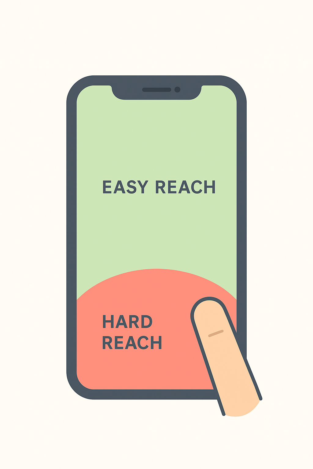
Thumb-Friendly Design → Place buttons, CTAs, and menus where users’ thumbs naturally reach.
Minimal Navigation → Keep menus simple and intuitive; avoid overwhelming users with too many options.
Test on Real Devices → Don’t rely only on simulators—test on actual phones and tablets.
Accessibility Matters → Ensure text is readable, contrast is strong, and the experience is inclusive.
Performance First → Mobile networks can be slow; design for efficiency.
Consistent Branding → A great mobile design still carries your brand identity seamlessly.